Dark mode functions exist in modern applications because they support better usability and minimize eye fatigue. The interface presents an interesting visual appearance due to its OLED and AMOLED display power-saving technology. Development enterprises in Bangalore include dark mode functionality in their premium mobile applications because users need it and this triggers rising demand as well as accessibility. Superior visibility becomes accessible for users within dim settings through dark mode adoption thus boosting adoption rates. Companies looking for maximum innovation rely on mobile app development company in Bangalore to achieve smooth dark mode implementations. The feature improves both appearance and user experience while satisfying personal preferences to create apps that function better. The evolution of mobile technology depends on dark mode as an indispensable factor that enables better app functionality and user-friendly interfaces.
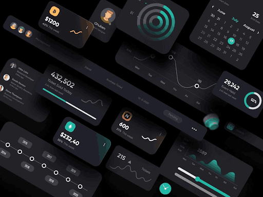
The Rise of Dark Mode
Dark mode consists of night mode and dark theme protocols which transform standard white interfaces by using dark backgrounds together with light text and icons. The concept dating back decades has become prevalent because OLED and AMOLED displays emerged with their energy-saving features.
The customer demand for customization has pushed Apple and Google alongside Microsoft to introduce dark mode features into their operating systems. The prevalence of dark mode functionality extends beyond operating systems because it is now common in social media platforms and messaging tools and productivity applications. Therefore it serves as an essential design standard for modern user interfaces.
Why Dark Mode Matters
Users receive greater benefits from dark mode because this choice delivers better usability while helping them avoid eye fatigue and assists them in reading content better. Minimal stress impacts vision because dark mode reduces both glare and blue light creation during viewing in low-light conditions. A dark mode setting provides excellent benefits to users who work at their screens for extended durations. The reduced stimulation delivered to eyes through dark mode leads to decreased headaches and less digital fatigue symptoms.
The dark mode offers both standardized modern design guidelines and a contemporary refined appearance that all users find elegant. The new theme in dark mode enhances accessibility because it provides an alternative display for people with light-sensitive vision. The increased importance of customization elements in app design enables developers to include dark mode as a systematic approach when creating software interfaces.
Benefits of Dark Mode
Less Eye Strain and More Comfort
Dark modes decrease your eye strain, particularly in low-light situations. Light screens can be annoying at times, whereas dark mode minimizes blue light exposure, thus increasing comfort and readability.
Battery Efficiency Gets Better
Now, in OLED and AMOLED displays, dark mode is beneficial as it saves the battery by eliminating black pixels. This cuts power usage down by 30-50% and is therefore an excellent feature for conserving battery life in portable devices.
Modern Aesthetic Looks and Contemporary Designs
Dark Mode has this wonderful contemporary appearance, which attracts users to it. This provides a luxury feel to the device, heightens visual contrast, and meets the contemporary looks of the period.
Improved Usability in Dim Conditions
Light mode minimizes glares and, as a result, discomfort while it is dark. Therefore, it is an improved experience for viewing and usability across different light conditions.
Accessible and Inclusive
For a visually impaired or light-sensitive user, dark mode will improve the experience. It can serve to alleviate discomfort for some with photophobia, while simultaneously making it easier to read for dyslexic users.
Challenges of Implementing Dark Mode
Despite its benefits, implementing dark mode in app design comes with several challenges that designers and developers must address.
Readability and Contrast
Having sufficient contrast between text and background is essential for readability. Low contrast makes content difficult to read, necessitating careful choice of colors to strike a balance between aesthetics and legibility.
Consistency With UI Elements
Dark mode necessitates consistency with UI elements such as buttons and icons. Some images will need to be tweaked so that they integrate nicely into the dark theme without breaking the design.
Third-Party Content Compatibility
Third-party content does not necessarily support dark mode, resulting in inconsistencies. So developers need to include adaptive theming solutions for ensuring a smooth experience.
Higher Development Effort
Dark mode implementation introduces design and coding complexity. So the developers have to support multiple themes, provide smooth transitions, and incorporate user preferences well.
Best Practices for Dark Mode Implementation
For delivering a successful dark mode experience, designers and developers must adhere to best practices in optimizing usability, aesthetics, as well as performance.
Employ True Blacks for OLED Efficiency
True black (#000000) for OLED screens optimizes battery life savings by disabling pixels. Nevertheless, maintaining true black with lighter grays avoids creating too much contrast that can irritate the eyes.
Provide Adequate Contrast
The text has to be legible in the background. White text (#FFFFFF) on black can strain eyes, so light gray or off-white is comfortable to use.
Add Adaptive UI Elements
UI elements must adapt dynamically for dark mode. Images, icons, and illustrations require adjustment, and semi-transparent elements ensure depth in the design.
Include a Toggle Option
Users must be allowed to toggle between light and dark modes seamlessly. An accessible switch in app settings enhances usability and caters to personal preferences.
Keep Accessibility Needs in Mind
Dark mode must provide accessibility by enabling users to change brightness, contrast, and text size, so it can be usable for individuals with varying visual impairments.
Test on Various Devices and Environments
Heavy testing guarantees dark mode works well in all devices, types of screens, and lighting. Usability tests are used to refine the design and correct any issues.
Conclusion
Dark mode is a critical aspect of contemporary app design, enhancing user comfort, beauty, and battery life. Although implementation is challenging, adherence to best practices guarantees an optimal experience. With advancing technology, dark mode will continue to define the future of UI/UX design.